
1892 to 1925
On foundation, the fledgling football club adopted the Brentford Rowing Club colours of claret and blue. Plain claret shirts are believed to have been worn during their early years, with the team being referred to as ‘The Reds’ in early newspaper reports. The main badge worn on these early shirts had the initials ‘BFC’ positioned around a zig zag representing the Thames, linking the foundling football club to its parent rowing club. In what would have been an expensive shirt at the time due to the method required to produce the stripes, the rowing club colours of claret and blue colours were fully visible and incorporated into the shirt seen in 1898.
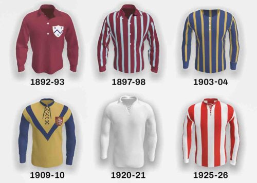 Claret and blue continued as the shirt colours until 1903.
The Rothschilds were a prominent philanthropic family in West London and owners of the land that became Gunnersbury Park. In 1903, possibly to curry favour with the family who had made financial donations to the Club, the colours of blue and gold were chosen for the teams shirts, the Rothschild horse racing colours. Fashions had changed; the thick, heavy collared shirts of the late 1800’s were out to be replaced by thinner shirts with either buttoned or round lace up collars. The Club readily accepted charitable donations with kits being donated by fans and members of the board. The 1909-10 shirt saw a chevron used for the only time and the return of a badge, this time the Middlesex County Arms.
Brentford joined the Football League in 1920 and the occasion was marked by a change of kit, although this was possibly enforced by the lack of materials following World War One. Out went the blue and gold, and Brentford joined a raft of clubs who adopted a plain white shirt. Brentford’s results in this early division were mixed, so in an effort to raise the Club’s fortunes a number of changes were made in 1925 including the adoption of a red and white striped shirt.
The reasoning for choosing these colours have been lost to the mists of time but the opportunity to be the only league London club in these colours was an inspired decision.
1938 – 1983 and the first sponsor
Slowly the fortunes of the Club changed. A lace up collar styled shirt was worn as Brentford won promotion out of Division Three South in 1933, then a rugby style collared shirt was the mainstay as they won the Second Division and reached the top flight for the first time. For the 1938-39 season Brentford wore the Brentford and Chiswick coat of arms on their home and change shirts. The badge had been specially designed as a tribute to Brentford’s rise to the top division. This badge was retained post war on the blazers of players and officials.
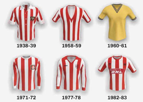 In 1958 the shirt style was updated to a modern V neck. For the 1960-61 season the home colours were changed to amber and blue; the reasoning for this change was officially due to the amount of away games that red and white would clash. Thankfully the red and white stripes were retained as the away strip, so concurrency of these colours from 1925 is maintained.
Fan pressure led to red and white returning as the home colours for the 1961-62 season. The V neck period soon ended as the popularity of Umbro’s Real style crew necked shirts dominated football shirt design for the remainder of the sixties.
A badge made up of the Middlesex coat of arms, a bee hive and the Club’s colours of red and white stripes was added to the 1971-72 shirt. Another badge was introduced on the 1972-73 shirt but was quietly withdrawn after being found to have the incorrect founding date on it. A new badge appeared in 1975 and would adorn the shirt for the next 20 years. It became known affectionately as the castle badge.
The popular seventies triangular collar style continued with Bukta and these became the first badged shirts to be put on sale by the Club. Further revenue was generated by a partnership with DHL who joined as the first shirt sponsor in 1982. Their logo was added to the previous seasons OSCA shirt.
1989 – 1999
Brentford’s next sponsorship was to last just over ten seasons as KLM came on board. Of all the shirts of this period possibly most controversial was the Hobot 1988-90 version. From a distance the stripes appeared to blend into a pink mass. The shirt was worn during the Club’s 100 year anniversary season with a special Bee badge replacing the castle badge temporarily. The 1992-95 Hummel shirt was a technological step up in design and manufacture.
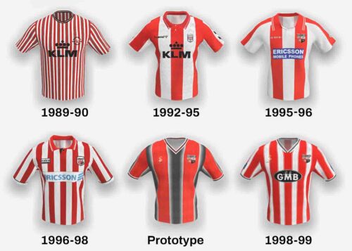 As well as being lighter than previous shirts it also had a jacquarded chevron design within the fabric. The following shirt from Core had another light, almost airtex quality, while Cobra Sports grabbed the nineties zeitgeist to produce a big, baggy and shiny version with sleeves that sailed long past the elbow.
In 1998 youth players Lee Tunnell and Martin Dobson paraded a prototype red and smudged grey shirt to a half time crowd. Club officials were advised as to the crowds feelings on this change as the chant of ‘red and white’ reverberated around the stadium.
The idea to alter the colours was swiftly dropped. Michael went on to be a Brentford captain and was the son of George who played for the team in the late 1960’s
Super League added extra pin stripes to the red on the 1998-2000 diamond jacquarded shirt, while Patrick added a thicker black outline to the stripes on their 2000-02 offering.
2000 – 2025
The 2004-05 shirt celebrated the Club’s 100 year tenure at Griffin Park, and as the Club sponsor was St George the flag of the patron saint was incorporated into the design. The away kit of that season was also a tribute to those blue and gold shirts worn 100 years earlier.
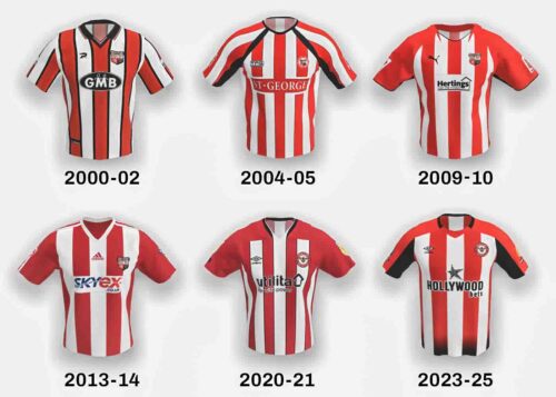
A Puma shirt with a vampire fanged collar was worn as Brentford’s rise to the Premier League began by winning League Two in 2008-09. Promotion to the Championship was secured again at Griffin Park in 2014 and the adidas shirt worn was added to the list of iconic promotion shirts. Umbro supplied the shirt that was worn as Brentford secured the final promotion needed to get to the Premier league in 2021. This season’s shirt fades to black at the base to blend into the shorts, black being the unofficial third colour of the Brentford shirt.
A centenary
As the 100th anniversary of the Club adopting red and white as their shirt colours dawns on us, we can only hope that the Club will use the opportunity to celebrate our Club colours and produce a shirt that not only honours our heritage but is fondly remembered for many years to come.
Tell us what you want to see for the centenary shirt(s) – Tell BU !
Brendan celebrates BFC shirts
“X”
Brendan online
Brendan’s email
